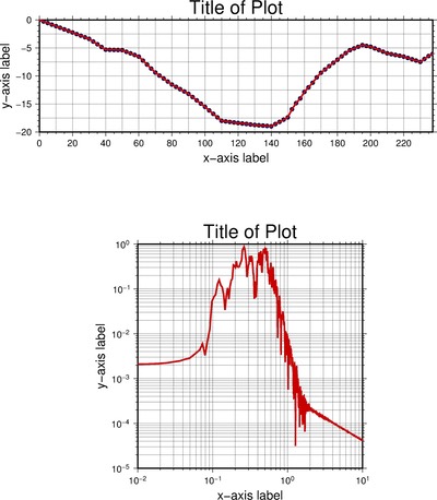
Figure 1. (Top) A plot of an elevation transect collected by me in the summer of 2013. (Bottom) A plot of a frequency spectrum of the Little Skull Mountain Earthquake after a narrow band-pass filter was applied (see my UNR research page)
In this short tutorial we will be creating a letter size page with an elevation transect plotted as well as a frequency spectrum. The point of the exercise is to explain the -B flag a little bit better as well as provide you with a script that plots a normal x-y plot and and a log-log plot. It took me a long time to figure out how to plot a log-log scale in GMT. Although I still don’t understand all of the flags that make it happen I will provide the code and data files that I used to generate these plots. The script will generate the plots shown in Figure 1. Once again this is just a starting script to help you get started. If you understand the scripts you should be able to modify them to generate any x-y plots imaginable.
Download the zip file containing the data and script here.
I am going to attempt to breakdown one of the more complicated flags in GMT, the -B flag. I like to think of the B representing the word boundaries because it describes how the axes (boundaries) are plotted and labeled. This flag also controls grid lines, tick spacing and the axes labels. The -B flag that were used to generate the top plot in Figure 1 are:
-B20g10f5:"x-axis label":/5g2.5f1:"y-axis label"::."Title of Plot”:WSen
This is a very long, and tedious flag to generate the plot shown above. So lets see if I can break it down so that we have some basic understanding of what is going on. I have color coded the command into basic groups, the blue group controls the x-axis, the magenta group controls the y-axis, the red group controls the title of the plot, and finally the green group controls which axes are plotted. So lets have a detailed look at the command controlling the x-axis.
20g10f5:"x-axis label":
This section of the -B flag controls how the x-axis is viewed in the top plot of Figure 1. The 20 represents the increment at which the main labels and large tick marks will appear. In this case I selected 20 so the labels and large tick marks go 0, 20, 40 …, etc. The g10 represents the grid spacing. I usually half the main annotation spacing so the grid looks even and square. Notice that there is a horizontal grid every 10 on the top plot in Figure 1. The f5 controls the minor tick mark spacing. If you enlarge the image, you can see the small (minor) tick marks occur every 5 on the top plot in Figure 1. In order the label the x-axis you need to use the specific format :”Insert Text Here”:, where anything in between the quotation marks will be printed on the x-axis. The format is exactly the same for the y-axis (magenta). If there were a z-axis then it would be separated by another forward slash ( / ).
In order to place a title above the plot it must be in the form of :.”Insert Text Here”:. You can place anything you want in the text. In this script the size of the font is controlled by setting FONT_TITLE to 24p using gmtset. The offset of the title is controlled by setting the MAP_TITLE_OFFSET to 0.1c using gmtset. Finally I want to show you some examples of what the WSen is doing to the plots. This last piece of the flag controls which boundaries are drawn and which ones are labeled. This is best shown by the examples below:
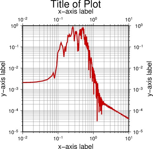
This is the plot when all capital letters are used, WSEN
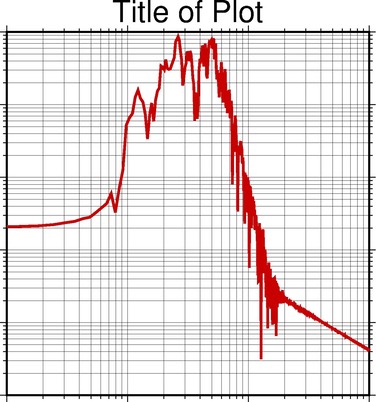
This is the plot when all lowercase letters are used, wsen
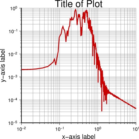
This is the plot when only two of the three letters are used and capitalized, WS